In the increasingly crowded space of AI technology content, even the most informative videos can get lost without an effective thumbnail. When creating thumbnails for my AI model review videos, I need to:
- Stand out in search results and recommended feeds
- Accurately represent video content without misleading viewers
- Maintain brand consistency across multiple videos
- Communicate technical content visually
- Drive clicks without resorting to clickbait tactics
Let’s explore my thumbnail design process, using my recent AI model review videos as examples.
My Thumbnail Design Process
1. Strategic Design Framework
I’ve developed a consistent framework for tech thumbnails that creates visual cohesion while maintaining unique identities for each video:

Analyzing my three recent thumbnails reveals a strategic design language:
Grok 3 Thumbnail
- Bold model name (“GROK 3”) with high contrast colors
- Key question (“Was it Censored?”)
- Relevant personality (Elon Musk) with visual elements suggesting controversy
- Purple/gray color scheme connecting to xAI branding
Sonnet 3.7 Thumbnail
- Model name prominently featured
- Action-oriented phrase (“Back • Kick’n!”)
- Brand-relevant color scheme (purple tones matching Claude branding)
- Visual metaphor (atom/neural network icon)
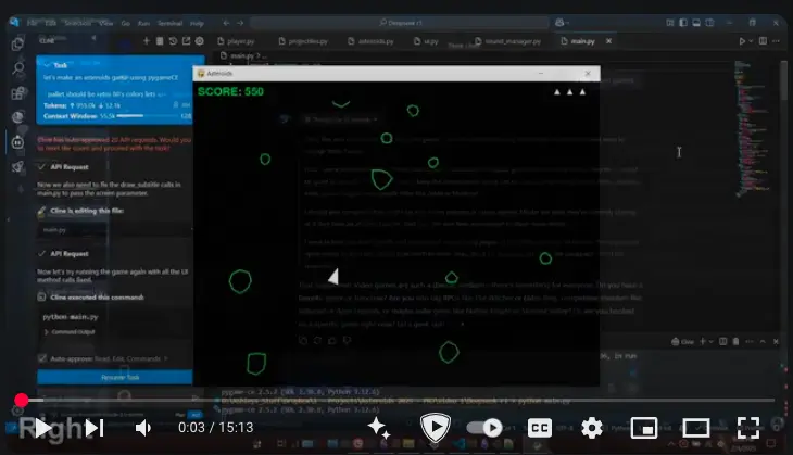
DeepSeek/Mistral Thumbnail
- Competitive comparison focus (“RIP o3 – Mini”)
- Multiple model logos to signal comparison content
- Distinctive color palette separating it from single-review videos
- Action suggestion (“I made a game with AI”)
2. Audience-Driven Design Decisions
Understanding my audience of AI enthusiasts and tech professionals shapes my thumbnail design choices:
Technical Authenticity
My viewers value technical accuracy and substantive content. I avoid hyperbolic claims like “MIND-BLOWING AI” in favor of specific testing claims and results.
Competitive Context
My audience is trying to choose between competing AI models. The thumbnails provide immediate comparative context (e.g., “Was it Censored?” points to a specific evaluation criterion).
Visual Tech Signals
AI-specific visual elements like neural network iconography, code symbols, and recognizable AI personalities signal relevant content to my target audience.
3. Canva as My Design Platform
I use Canva as my primary thumbnail design tool for its balance of professional capabilities and efficiency:
Template Development
I’ve created custom templates with standardized:
- Font pairings (sans-serif for headlines, clean secondary font for subtitles)
- Text element positioning
- Color schemes aligned with AI brand identities
- Background treatments
Brand-Specific Color Palettes
I maintain color swatches associated with major AI companies:
- Purple tones for Claude/Anthropic
- Red/white for xAI/Grok
- Blue variants for OpenAI
- Custom palettes for comparison videos
Visual Hierarchy
Each thumbnail follows a consistent visual hierarchy:
- Large, bold model name or primary subject
- Supportive subtitle or question
- Visual element (personality or graphic)
- Background treatment
Implementation Results
This strategic approach to thumbnail design has yielded measurable benefits:
- Improved Click-Through Rates: My standardized yet distinctive design approach has increased average CTR by approximately 20% compared to earlier, less systematic designs
- Channel Recognition: Regular viewers now recognize my thumbnails even before seeing the channel name
- Content Clarity: Potential viewers understand what the video offers before clicking, improving watch time and retention
- Reduced Production Time: With standardized templates, I now create professional thumbnails in under 15 minutes
Key Takeaways for Tech Content Creators
1. Consistency Builds Recognition
A consistent design language across thumbnails helps build channel recognition. Even as you create unique thumbnails for each video, maintain core elements that signal your brand.
2. Technical Audience ≠ Clickbait Immunity
Even highly technical audiences respond to strong thumbnail design. The difference is that technical viewers are looking for specific signals of value and authenticity rather than sensationalism.
3. Color Psychology Matters
Strategic use of colors associated with specific AI brands creates immediate context for viewers. My consistent use of purple tones for Claude content, red for Grok content, etc., helps viewers immediately categorize the video.
4. Canva Suffices for Professional Results
While professional design tools offer more capabilities, Canva provides everything needed for high-performing YouTube thumbnails. Its template system makes consistency easier to maintain across videos.
5. Testing Trumps Assumptions
No matter how experienced you become with thumbnail design, regular A/B testing continues to provide valuable insights. The YouTube algorithm and audience preferences evolve constantly.
Ready to Transform Your Channel’s Visual Identity?
Creating high-CTR thumbnails for technical content isn’t about clickbait—it’s about clear visual communication that resonates with your specific audience.
Book a consultation where I’ll analyze your current thumbnails and help develop a custom design strategy.


